
MY HOME - Choosing the colour scheme for the living room
Living in a rental house generally means that you don’t have full decorative freedom. The walls and floors are usually at the landlords discretion '- which means hard-wearing, economical and bland - something to suit all tastes and none at the same time. I don’t mean to say that I disagree with this. It is, after all, practical. However, as I told my mum when I was in my teens, “I don’t care whether the shoe is comfortable, but what does it LOOK like?!”.
Yet, here I am in forties in our rental house, with white walls and laminated wood flooring. It is perfectly fine, of course. But at the same time I was totally taken aback when my 11-year-old SON told me the other day, “If we owned this house I would change the flooring”. This is not off the back of anything I have ever said, as I was fairly nonplussed about the flooring - it doesn’t upset me. Although, it does slightly now.
So I took a notion to ‘do’ the living room last summer. We had a mish-mash of our own furniture and remnants of the landlords. They left very heavy brown corduroy couches, a huge dark wood coffee table and an ornate TV corner table. I wouldn’t choose an of them myself. However, we live with them as they are comfortable and I have nowhere else to put them if we got our own. So I had to work around these design faux pas and make our living room a little more cohesive.
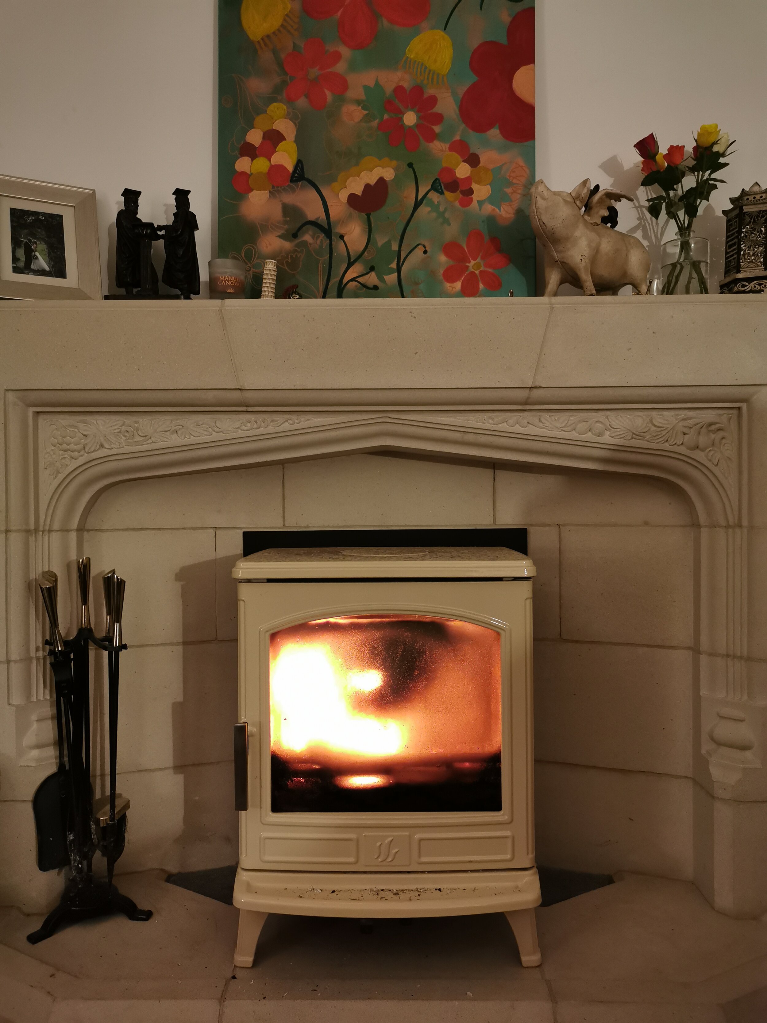
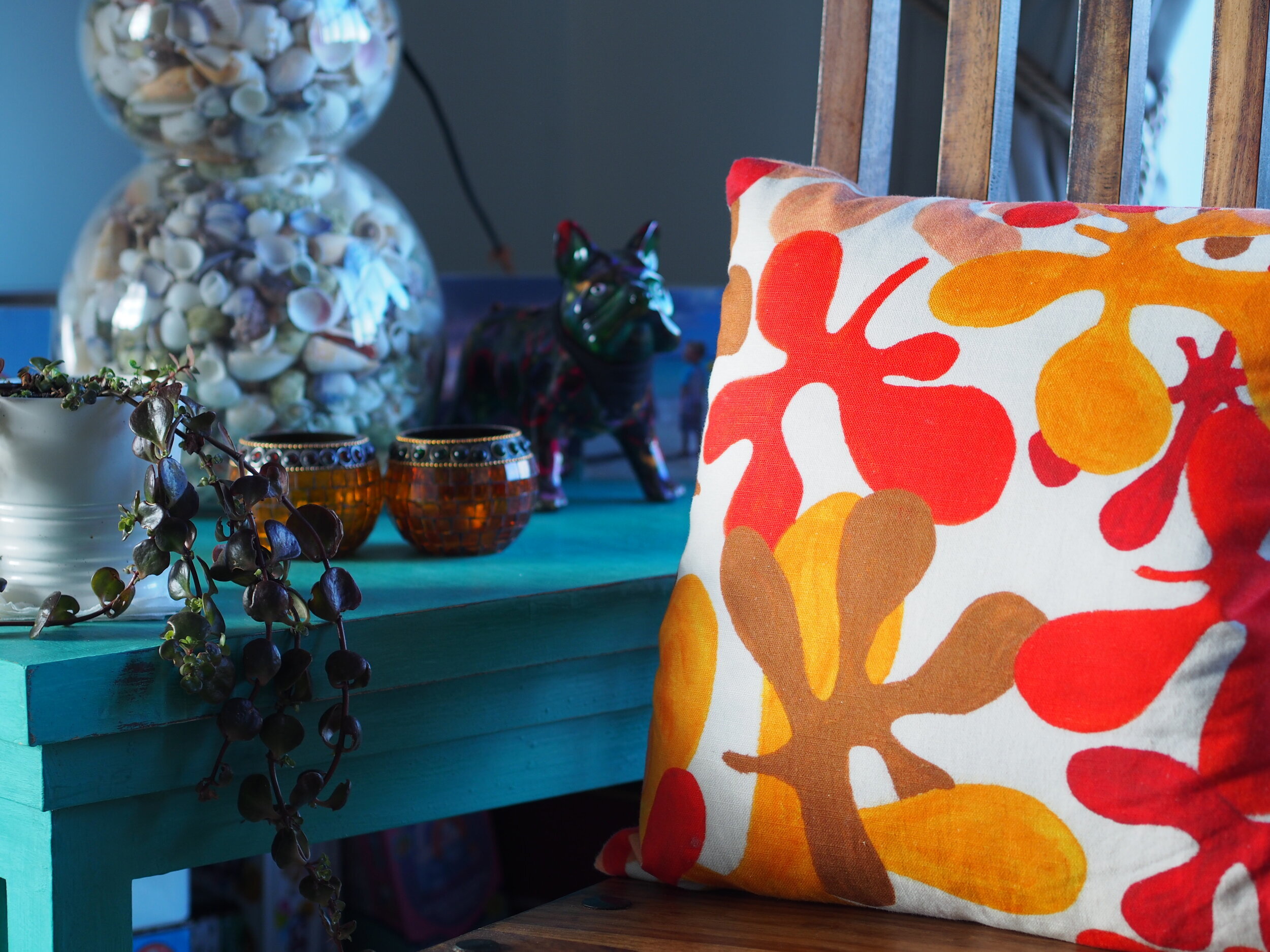
I had some Annie Sloan Florence paint left over from a previous project and I adore the colour. I painted a big block of a table that we had been given in the Caribbean. I love it now. A big, bright sold block of colour. Wanting to stick with a colour palette for the rest of the room, I studied Annie Sloan’s website. She said that Florence Green has undertones of copper. With that in mind, I looked at a sideboard that we have. It was originally white and I painted it Graphite Grey a few ears ago. AS we had moved house a couple of times, the surface was a bit knocked and chipped, so it needed a bit of love. I picked up some copper spray paint from Halfords in Navan. Woodies had it too, but it was much more expensive there. Perhaps a better quality, but I didn’t get it to compare.
I taped the table top outside in the garden last summer and in a reckless whim, I sprayed a double coat of the copper paint. It looks amazing - totally transformative and adds a wonderful complimentary pop of colour to the Florence Green table.
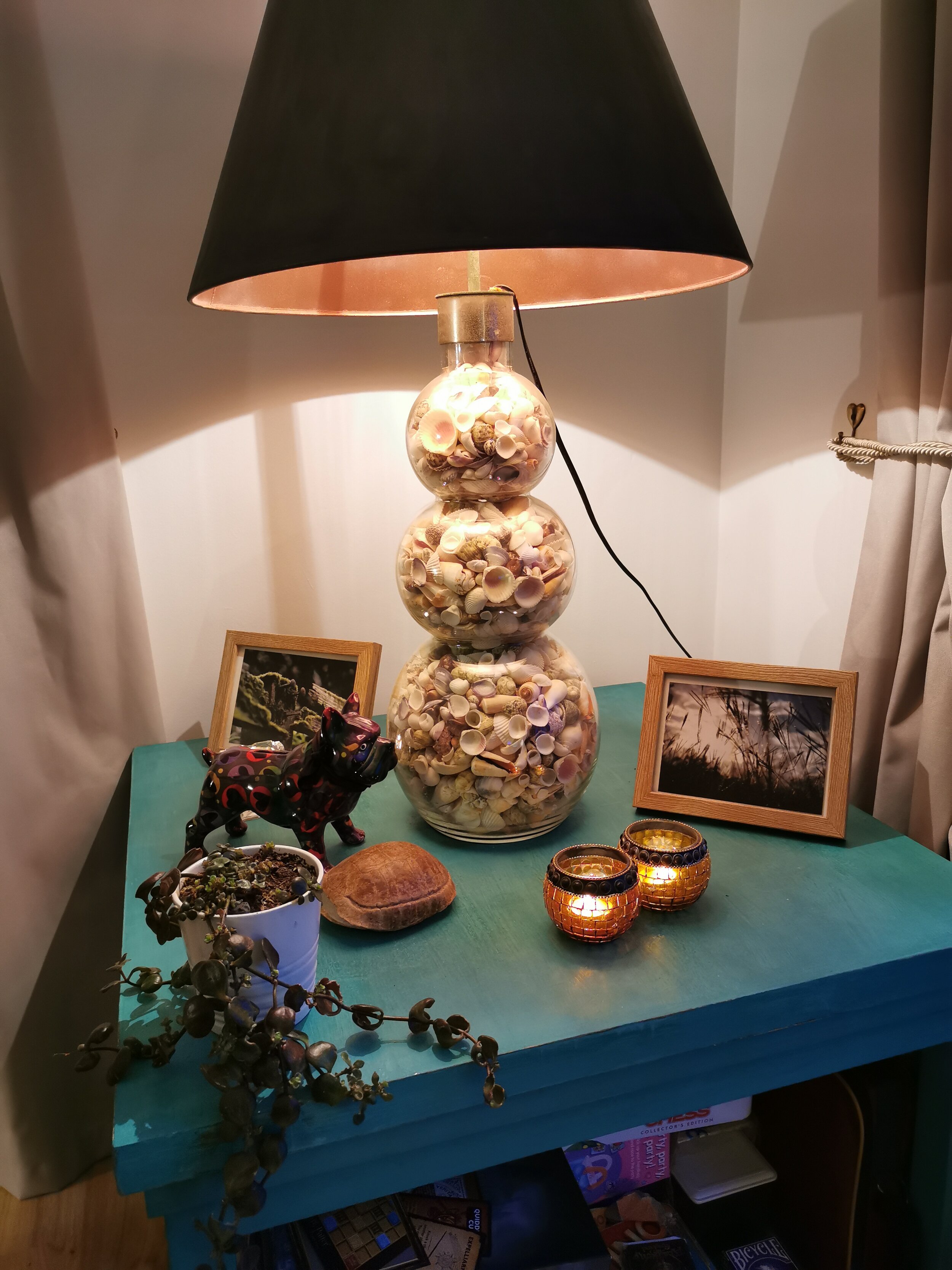
I wanted to bring the green and the copper together with a third colour- graphite grey. We have a shell lamp that we were given by a previous employer. The shade was a plain cream colour, so I painted the outside in Annie Sloan graphite, and used the copper spray on the inside. It gives a lovely mandarin’tinted glow in the evenings now when it is on.
Finally, I painted a canvas over the fire place and added some of the cushions that I recently designed, from the ‘Horse Chestnut’ collection.
Altogether, it is good but not perfect. And I love it like that - it means that I have a project that I can still ponder and improve on. Your home should never be finished, but rather in a state of transience so we can constantly move this or that, or add and takeaway. Bliss!